Introducing Forecast Analysis: See Every Major Model — and Where They Agree
When you’re writing for the public, a single model run is rarely the whole story. Different global and regional models capture different physics, boundary conditions, and timing — and your audience increasingly expects you to explain confidence, not just a number. That’s why we built Forecast Analysis in SkyDraft: one screen that plots the models you care about, shows how they diverge, and surfaces a clear ensemble consensus — so you can brief heat waves, cold snaps, or transition days with context, not guesswork.
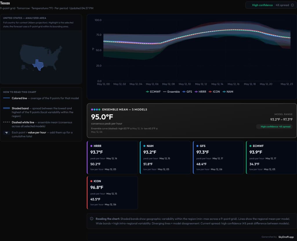
What you get in one view
Open Forecast Analysis from the app nav. Pick a region (for example a U.S. state or province), choose the variable you want to compare (such as temperature), and step through the forecast horizon. SkyDraft samples conditions on a 9-point grid across the area’s bounding box — not just one city pin — so the curve reflects a regional picture: an average line per model plus a shaded band for min/max spread inside that grid.
- Multi-model overlays — plot major guidance (e.g. ECMWF, GFS, HRRR, ICON, NAM) on the same hourly axis.
- Shaded bands — each band shows geographic variability inside the sampled grid for that model at each time step.
- Ensemble mean — a dashed reference curve summarizing consensus across the models you’ve selected.
- Confidence from spread — when peaks cluster, spread stays tight and the UI can surface a compact “high confidence” readout; when models diverge, the chart — and the band widths — tell the story.
- Per-model cards — scroll below the chart for each model’s peak and low in the window, with the hour they occur, so you can quote specifics in copy or on air.

How to read the chart (quickly)
Think of each coloured line as the model’s regional average over the grid for that hour. The ribbon around it is not “model error” in the statistical sense — it’s the spread of values across the nine sample points in your selected area. Wide ribbons mean the model fields are sloped or messy across the box (frontal gradient, mountains vs. plain, sea breeze, etc.). When several models track together and the ribbons stay narrow, you’re looking at a forecast with low inter-model disagreement and relatively uniform conditions — the kind of setup where a single headline number is defensible.
The dashed ensemble mean is your “if we average the models, what trend do we get?” line. Use it as the backbone for social copy, then cite individual models when one is an outlier (faster warm-up, delayed front, etc.).
Why this matters for communicators
Meteorologists, digital editors, and storm-focused creators all face the same tension: timelines are short, but responsible messaging means showing range when models disagree. Forecast Analysis lets you glance at divergence before you promise a peak temperature or a frontal passage time. Pair it with SkyDraft’s generation flows and you turn that context into headline, thread, or broadcast teaser — grounded in multi-model reality instead of whichever tab was open last.
Try it
After you sign in, open Forecast Analysis from the app sidebar (it’s marked beta while we keep improving it). The full interactive experience is available on the Pro plan. If you’re on Free or Starter, you’ll see an upgrade path — we still wanted you to know what the tool does before you commit.
Load your region of interest, compare tomorrow’s highs or tonight’s lows, and use the model cards when you need exact extrema and times for a citation or infographic.
The Free plan includes 10 generations per month for AI copy — jump in and explore Analysis alongside Weather Map and Generate whenever you’re building your next briefing.
— The SkyDraft Team
Ready to try SkyDraft?
5 free generations per month. No credit card required.
Create your free account →